Mustang Meal Share Re-Design
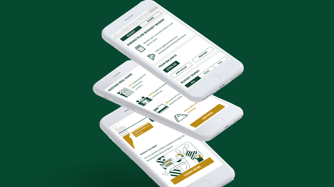
Working Prototype
Challenge
1 in 4 students at Cal Poly San Luis Obispo experiences food insecurity. The worry over securing their next meal distracts students from their goals and takes away from their college experience.
Cal Poly offers an initiative named Mustang Meal Share to combat this, yet it faces crippling problems.
"We didn't meet our quota at all. So my concern is the program is not really sustainable and it's challenging to predict what the donations are going to be... ...the donations are really down." -Joy (Cal Poly Dean's Office)
"The current platform for donations is too clumsy. Anyone should be able to donate easily." -Andrea (Cal Poly Campus Dining)
"We do the email blasts and the portal announcements, but a lot of people don't read the emails that come from campus dining." -Sanjana (Swipe Out Hunger Club)
Goals
Decrease food insecurity at Cal Poly
by Increasing donations to Mustang Meal Share
by Improving the donation system's usability and availability to freshmen.
Persona:

.
“I always have extra Plus Dollars that I’m looking to spend. Usually I buy my guy friends food and sometimes just give them my card at the end of the quarter.”
Examination of the Current System
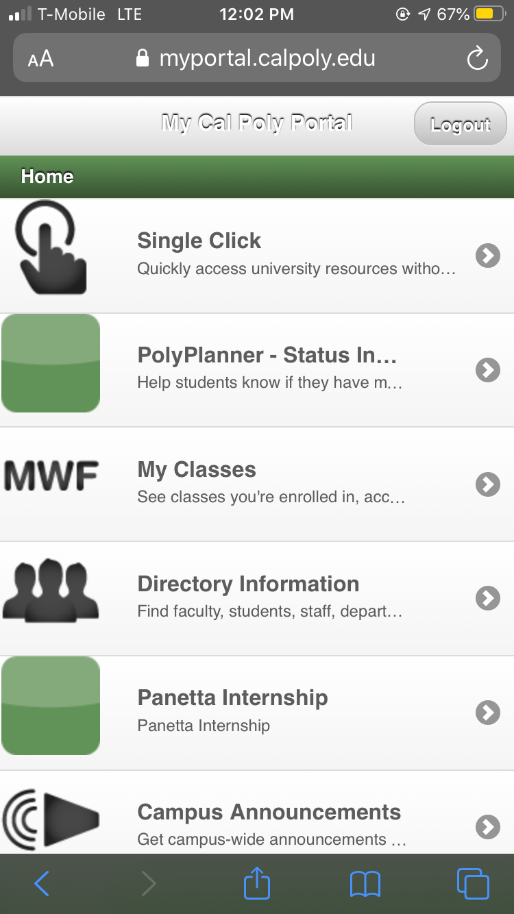
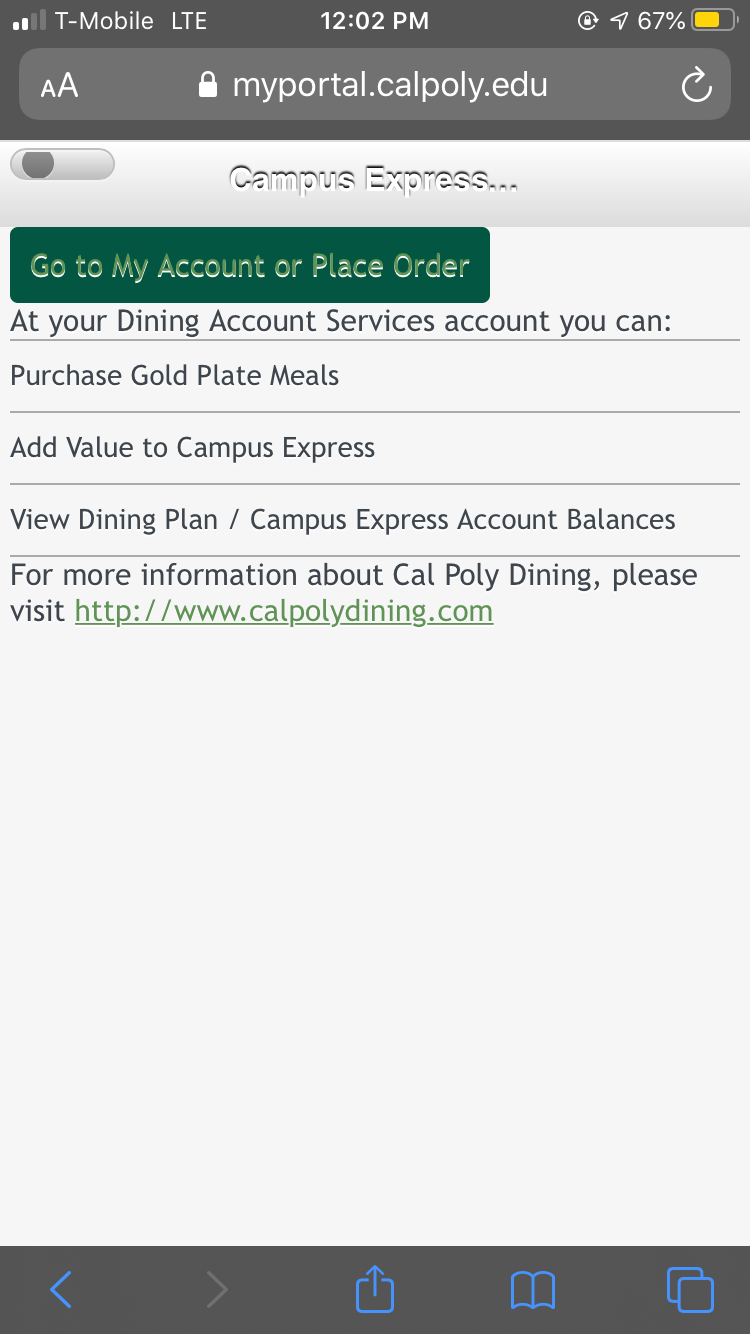
The process to check your own meal plan balance:
Tools used: Cal Poly Portal
.


.
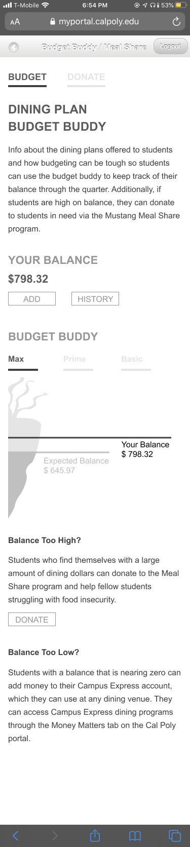
The process to check Budget Buddy, our campus budgeting tool:
Tools used: Campus Dining Website
Note: this tool does not include a student's personal balance, just their expected balance.
.


.
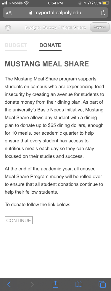
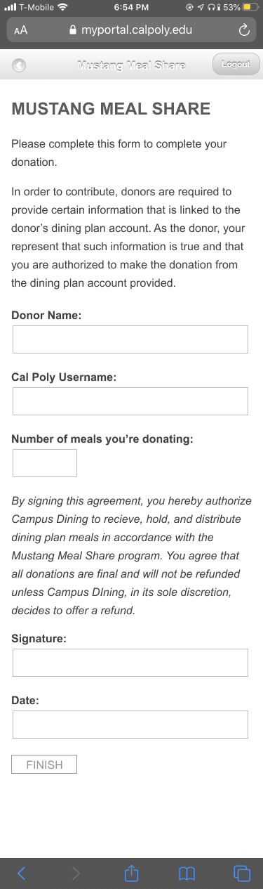
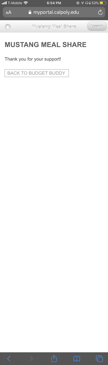
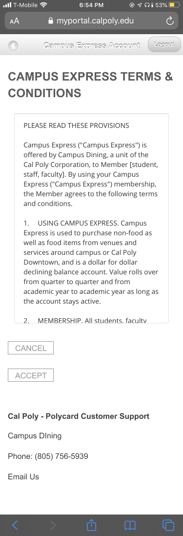
The process to donate through Mustang Meal Share:
Tools used: Campus Dining Website, Docusign, email, native browser
.


Insights
The process to donate through Mustang Meal Share needs to be collected into one space, so that students can view their balance, expected balance and decide to donate all in one place.
It needs to be located in a familiar location to students, rather than a website rarely used. When asked which school-related digital resources they use, not a single freshmen named the Campus Dining website.
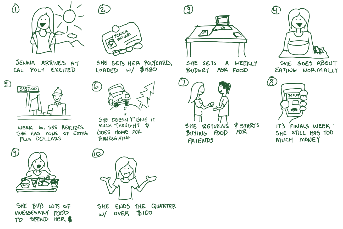
Storyboarding
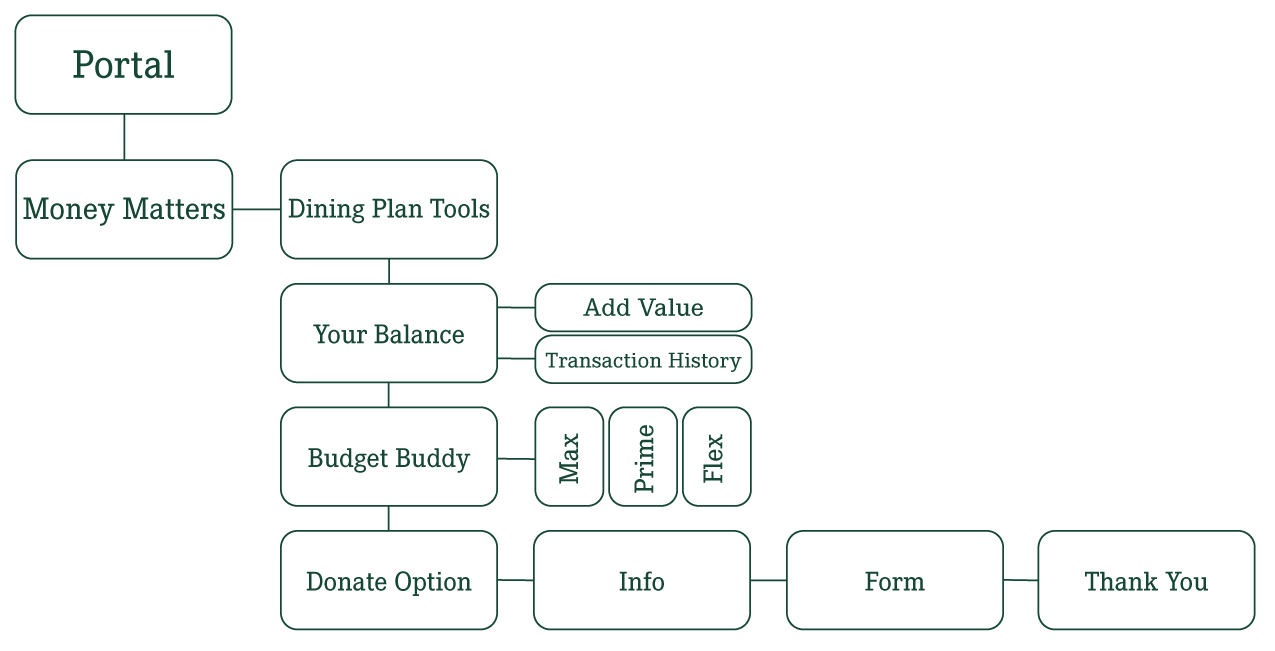
Information Architecture
Wireframe Rd. 1
Rd. 2 and User Interface
After running User Tests, I focused on a couple key adjustments before implementing the full design. A few key changes are displayed here.
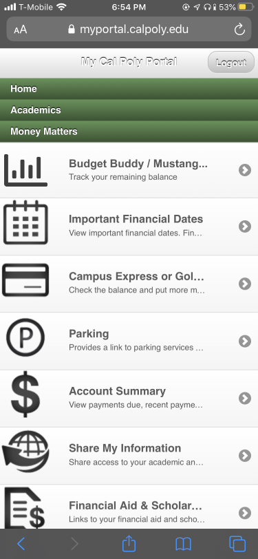
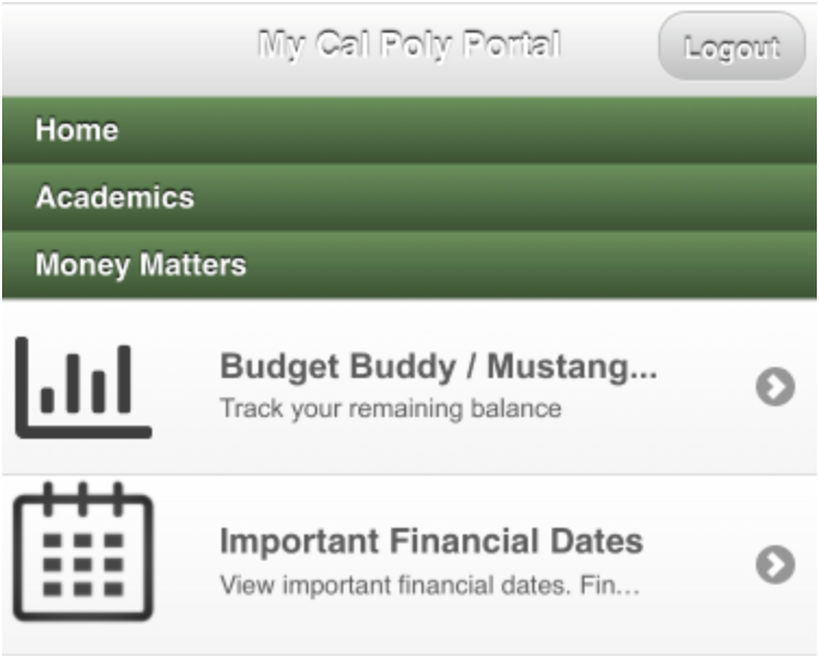
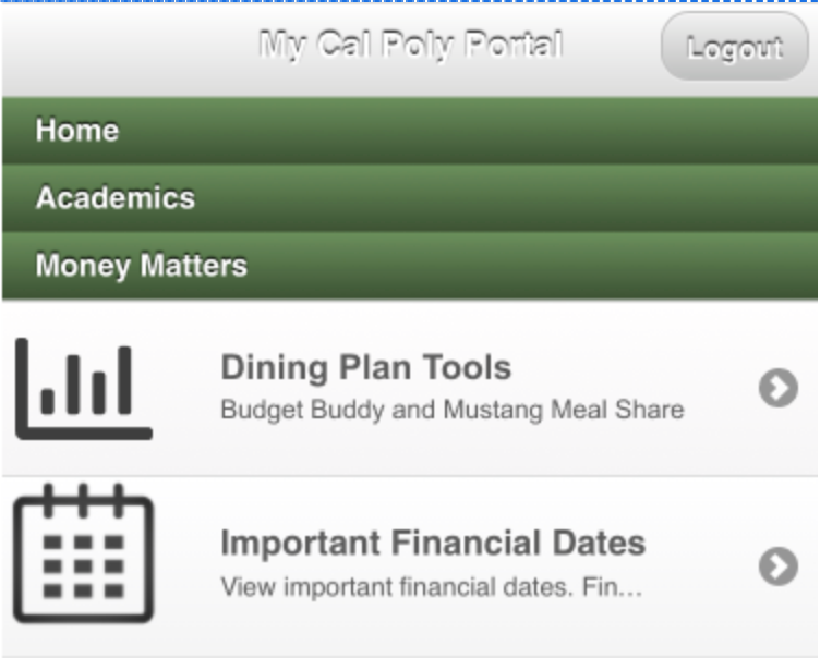
The entry point within Money Matters needed to be more clear, with some users choosing the "Campus Express" option over "Budget Buddy / Mustang..." It is essential to make the option clear while still working within the line-length limitation.
.
.
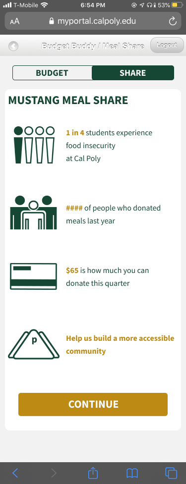
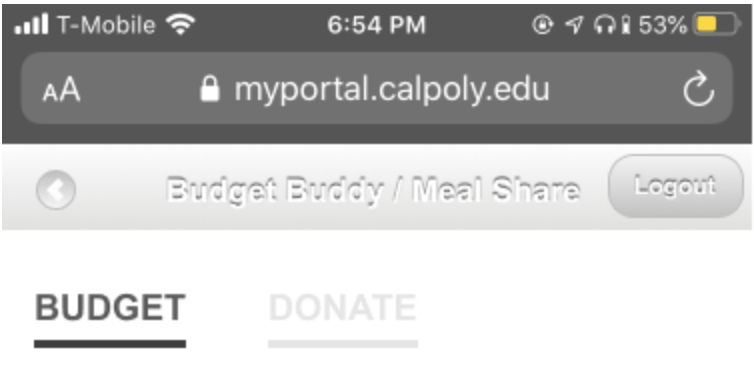
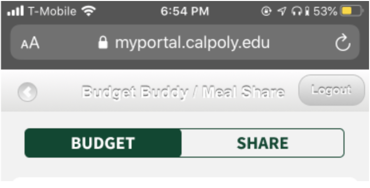
The "Donate" tab at the top of the main page was under-used. I believe this to be mainly due to the wireframe design where it was understated. Even though access to the Mustang Meal Share page is available lower on the page, I want the tab to be an early signal and reminder of the option to donate.
.
.
Easier-to-digest information. Users often wanted more information about the program, even though there was lots of it before their eyes. What this meant was that no one was reading the paragraphs displayed. I pared the info into bite-sized chunks and made it more visually appealing so users will understand why they are donating.
.